Packaging that photographs — and still ships.
The tension between social-ready design and pallet-ready reality.
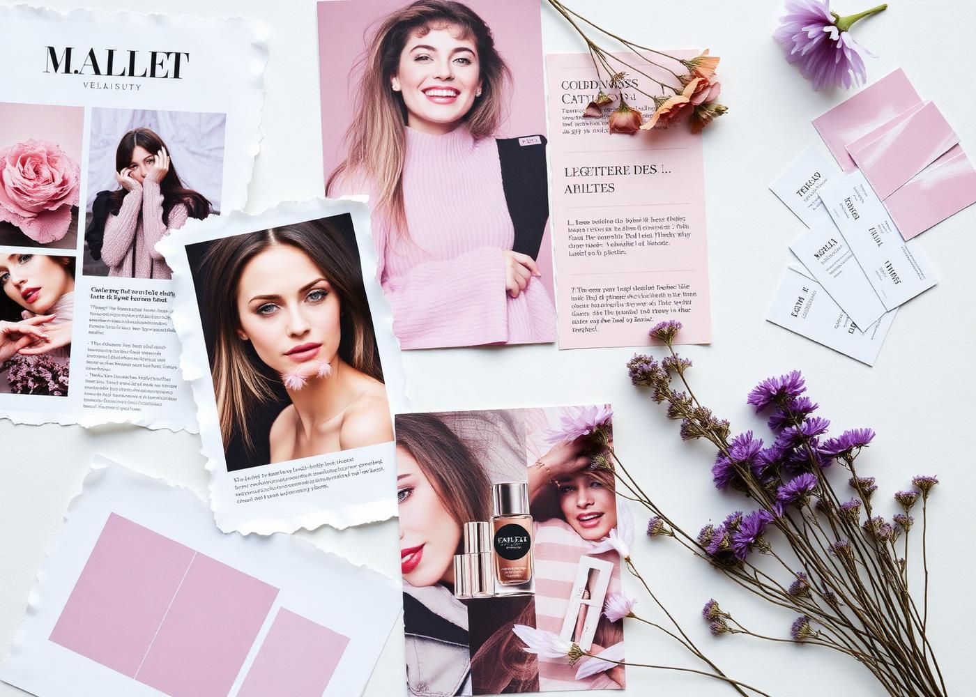
Every packaging brief now has two audiences. The first is a shopper holding a phone, deciding in a second whether the product deserves a saved reel. The second is a warehouse team stacking six hundred units on a pallet and a merchandiser fitting the range into a planogram that was set six months ago.
Design for only the first and the range is beautiful and unshippable. Design for only the second and it never gets photographed. The whole craft of retail-ready design is holding both briefs at once.
What ‘photographs well’ actually requires
Products that perform on social share a few visual properties: a distinct silhouette that reads at thumbnail size, a colour story that survives compression, tactile finishes that reward a close-up, and typography confident enough to be legible without a caption.
- Silhouette — the outline is recognisable before the logo is.
- Colour — chosen for how it renders on a phone screen, not only under D65.
- Finish — soft-touch, embossed, foiled or matte; texture the camera can see.
- Type — restrained, generous, front-of-pack legible at fifty pixels.
What ‘ships well’ actually requires
The same range has to survive a supply chain that is largely indifferent to how it looks. That means predictable case counts, secondary packaging that palletises efficiently, primary packs that stack without denting, closures that do not leak in transit, and finishes that do not scuff on a conveyor.
- Cases that divide cleanly into planogram facings.
- Bottles with a base footprint that stacks and shelves without wasted space.
- Caps and pumps that pass drop-test at full fill.
- Finishes that survive rub, scuff and shrink-wrap.
Where the two briefs collide
Most conflict happens in three places: overly sculptural bottles that photograph beautifully and pallet terribly, foils and hot-stamps that catch light on camera and scuff in transit, and colour systems that look premium on a moodboard and disappear on a shelf lit at 4000K.
The fix is not to compromise both. The fix is to decide, per range, which decisions belong to social and which belong to shipping — and to prototype against both from week one.
How we design against both briefs
Every ICS pack development runs a parallel track. The design studio prototypes for camera — printed dummies, styled shots, phone-lit reels — while the pack engineering team runs drop-tests, palletisation and line-speed trials on the same geometry. The two teams meet weekly and the design either gets defended, adjusted or replaced with data on the table.
A working checklist
If you are briefing a beauty range this year, these are the questions we ask before a bottle is ever tooled.
- Does the silhouette read at thumbnail?
- Does the colour hold up under retail lighting and phone compression?
- Does the pack survive a one-metre drop at full fill?
- Does the case divide into standard planogram facings?
- Does the finish survive shrink-wrap, transit and a shopper’s handbag?
Work with ICS
Have a brief that touches this?
We build ranges with retailers and brand owners from concept to shelf — trend, formulation, packaging and supply, under one roof.
Start a conversation →More from Insights
The quiet luxury of ‘skinified’ body care.
Body is the new face. What that means for retailer aisles this year.

Fragrance under load-shedding: stability that survives the shelf.
How we test scent longevity across South African warehouse conditions.
Private label is the new hero brand.
Retailer ranges are winning on innovation, not just price.